
TTC — End-to-End UX Redesign
TTC — End-to-End UX Redesign
A full-cycle UX redesign improving TTC website navigation through IA auditing, usability testing, and iterative validation.
Role
UX Designer
Users
TTC riders (task-based usability testing)
Methods
UX audit, usability testing, IA analysis, low-fi & hi-fi prototyping
Context & Goal
Context & Goal
Identifying usability gaps in a public-sector digital experience
The design strategy focused on three key pillars:
Public transit riders often need information quickly:
Is my train delayed? Which route should I take? How much will the trip cost?
Is my train delayed? Which route should I take? How much will the trip cost?
The Toronto Transit Commission website is designed to answer these questions but finding those answers isn’t always easy.
While the platform offers essential services like trip planning, fare details, and service alerts, users frequently encounter difficulties navigating the site and locating the information they need.
This project began with a simple question:
Why does such a critical service still feel difficult to use?
Why does such a critical service still feel difficult to use?
Through usability evaluation and research-driven design improvements, I explored how the experience could be redesigned to make key information easier to find and everyday transit tasks faster and more intuitive.
PRODUCT CONTEXT
The Toronto Transit Commission website supports essential rider tasks such as trip planning, service updates, and fare information. However, users often struggled to locate key information efficiently due to unclear navigation and content hierarchy.
PROJECT GOAL
The goal of this project was to identify usability gaps in the existing experience and iteratively improve clarity, findability, and task efficiency through research and testing.
Context & Goal
Identifying usability gaps in a public-sector digital experience
Public transit riders often need information quickly:
Is my train delayed? Which route should I take? How much will the trip cost?
The Toronto Transit Commission website is designed to answer these questions but finding those answers isn’t always easy.
While the platform offers essential services like trip planning, fare details, and service alerts, users frequently encounter difficulties navigating the site and locating the information they need.
This project began with a simple question:
Why does such a critical service still feel difficult to use?
Through usability evaluation and research-driven design improvements, I explored how the experience could be redesigned to make key information easier to find and everyday transit tasks faster and more intuitive.
PRODUCT CONTEXT
The Toronto Transit Commission website supports essential rider tasks such as trip planning, service updates, and fare information. However, users often struggled to locate key information efficiently due to unclear navigation and content hierarchy.
PROJECT GOAL
The goal of this project was to identify usability gaps in the existing experience and iteratively improve clarity, findability, and task efficiency through research and testing.
Research & Evaluation
Approach / Strategy
Evaluating the existing experience to uncover usability issues
Evaluating the existing experience to uncover usability issues
▸ The project began with an evaluation of the current TTC website to understand where and why users encountered friction.
▸ Research activities included:
▸ UX audit of the existing website
▸ Task-based usability testing with riders
▸ Observation of navigation behavior and task completion challenges
▸ This phase focused on identifying patterns rather than isolated issues.
Research & Evaluation
Evaluating the existing experience to uncover usability issues
▸ The project began with an evaluation of the current TTC website to understand where and why users encountered friction.
▸ Research activities included:
▸ UX audit of the existing website
▸ Task-based usability testing with riders
▸ Observation of navigation behavior and task completion challenges
▸ This phase focused on identifying patterns rather than isolated issues.
Key Insights
Key Insights
Usability issues stemmed from unclear structure and mismatched information hierarchy
Usability issues stemmed from unclear structure and mismatched information hierarchy
▸ Insights from the audit and testing revealed consistent challenges:
▸ Users struggled to locate critical information quickly
▸ Navigation labels did not align with user expectations
▸ Key rider tasks were buried under secondary content
▸ These issues indicated a misalignment between the site’s structure and rider mental models.
We tested the current Toronto Transit Commission website with frequent and first-time users to uncover usability issues and generate insights for improving navigation and task efficiency.

Key Insights
Usability issues stemmed from unclear structure and mismatched information hierarchy
▸ Insights from the audit and testing revealed consistent challenges:
▸ Users struggled to locate critical information quickly
▸ Navigation labels did not align with user expectations
▸ Key rider tasks were buried under secondary content
▸ These issues indicated a misalignment between the site’s structure and rider mental models.
We tested the current Toronto Transit Commission website with frequent and first-time users to uncover usability issues and generate insights for improving navigation and task efficiency.
Design & Interation
Design & Interation
Iteratively improving the experience through research-driven design decisions
Iteratively improving the experience through research-driven design decisions
Design decisions were informed by research insights and validated through multiple rounds of testing and refinement.
Clarifying navigation by restructuring content around user tasks:
▸ Analysis of the existing IA showed that content was organized by internal logic rather than rider goals.
▸ To address this, the team restructured the IA to prioritize primary rider tasks.

Key actions:
▸ Mapped user goals to content categories
▸ Simplified navigation hierarchy
▸ Revised labels to match user language
Header IA

Design decision:
Shift from organization-based categorization to task-based navigation.
New IA

Low-Fidelity Prototyping
Low-Fidelity Prototyping
Testing structure and flow before visual refinement
▸ Low-fidelity wireframes were created to validate the revised IA and navigation flow without introducing visual bias.
The focus at this stage was:
▸ Navigation clarity
▸ Page structure
▸ Task completion path
User Flow Task 2

User Flow Task 3

This allowed early feedback on structure before moving to detailed design.
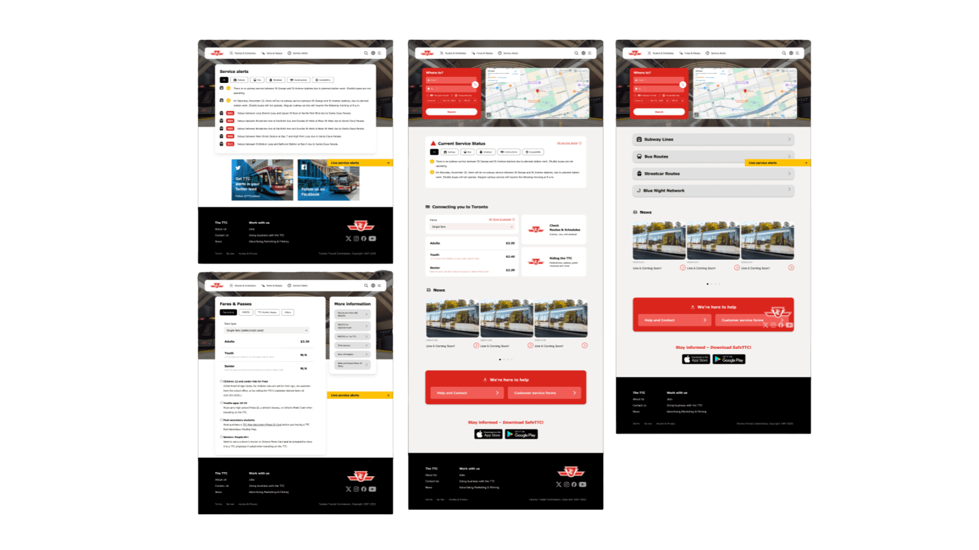
Mid-fidelity Design
Usability Testing & Iteration
Usability Testing & Iteration
Validating design decisions through user feedback
The low-fi prototypes were tested with 5 users to assess whether the new structure improved clarity and usability
Feedback indicated:
▸ Improved understanding of where to find information
▸ Reduced navigation confusion
▸ More predictable task flows
Based on feedback, iterations included:
▸ Refining navigation labels
▸ Adjusting content grouping
▸ Removing unnecessary steps
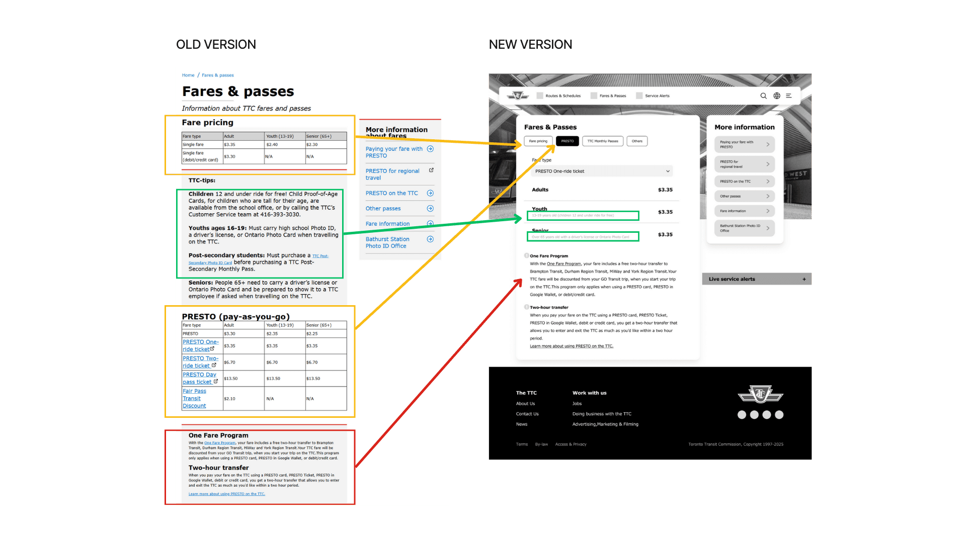
Fare & Passes Design Comparison
Final Design Refinement
Final Design Refinement
Refining the interface while preserving validated structure
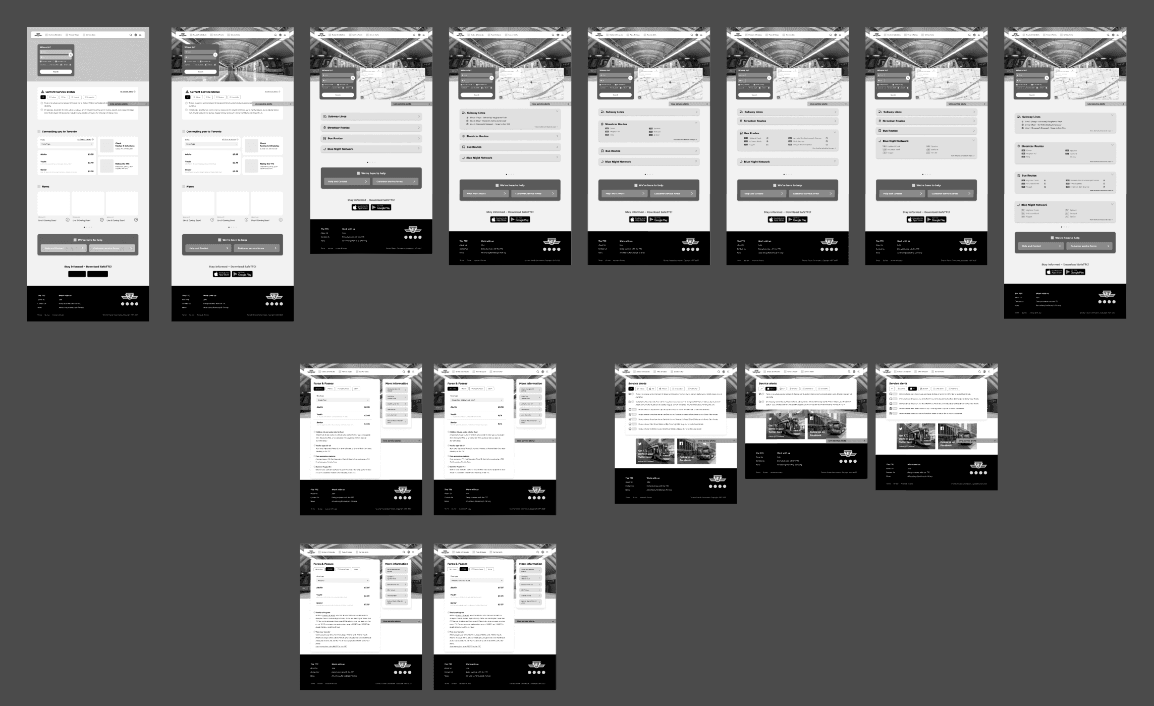
▸ After validating the structure, the design was refined into higher-fidelity screens that maintained the tested IA while improving visual hierarchy and readability.
▸ After validating the structure, the design was refined into higher-fidelity screens that maintained the tested IA while improving visual hierarchy and readability.
Final designs aimed to:
▸ Reinforce task prioritization
▸ Improve scannability
▸ Support accessibility considerations
Final High-fidelity Design
Outcome
Outcome
Improved clarity and task efficiency in key rider flows
Improved clarity and task efficiency in key rider flows
The redesigned experience resulted in:
▸ Clearer navigation structure
▸ Faster access to key information
▸ Greater user confidence when completing tasks

While this was a conceptual redesign, testing indicated meaningful improvements in usability and comprehension.
Reflection
Reflection
Designing for public-sector systems requires clarity, restraint, and validation
Designing for public-sector systems requires clarity, restraint, and validation
This project reinforced the importance of:
▸ Grounding design decisions in user research
▸ Letting information architecture drive interface design
▸ Iterating based on real user feedback rather than assumptions
While this was a conceptual redesign, testing indicated meaningful improvements in usability and comprehension.
Design & Interation
Iteratively improving the experience through research-driven design decisions
Design decisions were informed by research insights and validated through multiple rounds of testing and refinement.
Clarifying navigation by restructuring content around user tasks:
▸ Analysis of the existing IA showed that content was organized by internal logic rather than rider goals.
▸ To address this, the team restructured the IA to prioritize primary rider tasks.
Key actions:
▸ Mapped user goals to content categories
▸ Simplified navigation hierarchy
▸ Revised labels to match user language
Header IA
Design decision:
Shift from organization-based categorization to task-based navigation.
New IA
Low-Fidelity Prototyping
Testing structure and flow before visual refinement
▸ Low-fidelity wireframes were created to validate the revised IA and navigation flow without introducing visual bias.
The focus at this stage was:
▸ Navigation clarity
▸ Page structure
▸ Task completion path
User Flow Task 2
User Flow Task 3
This allowed early feedback on structure before moving to detailed design.
Mid-fidelity Design
Usability Testing & Iteration
Validating design decisions through user feedback
The low-fi prototypes were tested with 5 users to assess whether the new structure improved clarity and usability
Feedback indicated:
▸ Improved understanding of where to find information
▸ Reduced navigation confusion
▸ More predictable task flows
Based on feedback, iterations included:
▸ Refining navigation labels
▸ Adjusting content grouping
▸ Removing unnecessary steps
Fare & Passes Design Comparison
Final Design Refinement
Refining the interface while preserving validated structure
▸ After validating the structure, the design was refined into higher-fidelity screens that maintained the tested IA while improving visual hierarchy and readability.
Final designs aimed to:
▸ Reinforce task prioritization
▸ Improve scannability
▸ Support accessibility considerations
Final High-fidelity Design
Outcome
Improved clarity and task efficiency in key rider flows
The redesigned experience resulted in:
▸ Clearer navigation structure
▸ Faster access to key information
▸ Greater user confidence when completing tasks
While this was a conceptual redesign, testing indicated meaningful improvements in usability and comprehension.
Reflection
Designing for public-sector systems requires clarity, restraint, and validation
This project reinforced the importance of:
▸ Grounding design decisions in user research
▸ Letting information architecture drive interface design
▸ Iterating based on real user feedback rather than assumptions
While this was a conceptual redesign, testing indicated meaningful improvements in usability and comprehension.